
No video this time, but the conclusion to Rob's essay.
Read the entire essay on Fortnight
"The images in this essay are pictures of original books designed by Bruce Rogers. Rob is a collector and offered us a view."
Times New Roman was the first typeface to be commissioned by a newspaper for its private use. The Times of London wanted a new and tasteful typeface that would be condensed enough to allow for large amounts of text to fit on a page. The results were very successful, and Times New Roman is now one of the most popular typefaces in the world.
Although it’s condensed nature makes it less suitable for high end book work where no expense is spared, Times New Roman is highly legible, readable, and seems perfectly at home with almost any text making it a popular choice. Today we have so many typefaces available to us that we don’t give it much thought, but we can thank Stanley Morison and his peers for that.

First text page from "Persephone"
Many of the famous historic typefaces had been lost and others had been totally forgotten. Morison’s revivals coincided with a Renaissance of typography in the early twentieth century.
Suddenly printers who had previously only owned a few typefaces in only a few sizes had access to vast quantities of freshly cast type in an array of styles and sizes. This explosion of easily available type would lead to the development of the modern book designer. I don’t want to suggest that books were not designed before, but they generally looked more or less the same and followed design rules specific to each printer or press.

"Persephone"
Indeed, the way we can tell who printed many early books is by the way they look and the type that was used. The idea that a book should be designed to complement the content was a new idea, one that was fully embraced by Bruce Rogers.
Today Rogers is known as being the foremost book designer in American history, and the reason is partly due to his embrace of the new technology of his day. Rogers designed every book differently to suit the text, something we take for granted today. His books were widely collected, no doubt in part due to the excitement of each having its own typographic treatment and matching bindings. Rogers believed that the typeface and design treatment was most successful when it was in harmony with the text.
For example, it might seem novel to perform a play of Shakespeare in modern dress, but once the novelty has worn off, you may be left with just a poor gimmick. So Rogers believed that books too should be in period dress. The typographic treatment was not intended to distract, but to complement the text at hand.

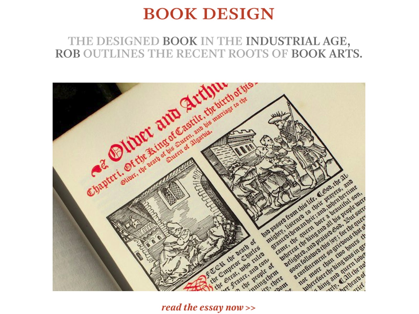
Spare label bound into "Oliver and Arthur"
Rogers passed away in 1957 with not too much notice, but his Paragraphs on Printing remains
a great book for the aspiring topographer as he explains in some
depth his approach to design, as well as some basic typographic rules.
The twentieth century had also brought forth the Modernists. The Bauhaus
and the emerging Swiss style of type design attempted to strip away all
but the bare essentials favoring typefaces such as Helvetica.

Title page from "Oliver and Arthur"
The serifs of the Roman letter that had lost their reason for existence
in the 1700s were now simply cut off and the san-serif became
increasingly popular. Unfortunately, in their pursuit of purity,
many Modernists disregarded the very functional aspects of classic
design and inherent readability of traditional typography.
Technology was also changing; letterpress was being threatened by offset lithography. Unlike letterpress, offset is able to print variations in tone and detailed photographs at high speed. Physical type is not used at all, and the printing plates are made photographically. The absolutely smooth glossy surface of the offset printed page was a thing of perfection to the early Modernist.
Technology was also changing; letterpress was being threatened by offset lithography. Unlike letterpress, offset is able to print variations in tone and detailed photographs at high speed. Physical type is not used at all, and the printing plates are made photographically. The absolutely smooth glossy surface of the offset printed page was a thing of perfection to the early Modernist.

An image of a book in "period costume"
By the 1970s letterpress was considered commercially obsolete. The
efficiency and slick perfection of the offset printed page was
unachievable by letterpress. As a result, press and type casting
equipment that only a few decades before had been some of the most
valuable and expensive machinery produced, were being scrapped or given away.
Intrigued with the idea of being able to self-publish, some individuals
started collecting letterpress equipment. This is really the beginning
of what is today called the book arts.

Title page from "Utopia"
Most of these early self-publishers were not skilled printers by
profession, but poets and artists. They favored the small and easy to
operate proof press to the complex and large production presses. Proof
presses, especially Vandercook presses made in the US, were designed for
precisely printing small numbers of sheets used to proofread and
correct type.
Sometimes they were used to make prints that would then be
photographed and printed by offset because metal type still looked
superior. A few people saved type casters, but not as many. The type
casters necessitated a highly skilled, or at least a very mechanically
savvy operator, along with a great deal of space and related tools.

"Utopia"
Some of the large production presses found new jobs die cutting or foil
stamping, but the vast majority of equipment of all types was lost. Some
of these early book artists became involved with universities and began
to start teaching, as well as legitimizing, the field and its claim as
an art.
Today letterpress and the book arts are enjoying a tremendous explosion of interest. The recent invention of photopolymer printing plates allows letterpress artists to design their work on the computer and have plates made. With type casting equipment, and the people who know how to run it becoming more and more rare, polymer plates seem to insure a bright future for letterpress. There is a tremendous and growing interest in letterpress.

"Ancient Books and Modern Discoveries"
It seems that the further technology gets away from letterpress, the
more people feel drawn to it. It is ironic to think that now offset is
in the position letterpress was once in as digital printing, and
increasingly digital distribution, send offset presses out of business.

"Ancient Books and Modern Discoveries"
Still, there is nothing like the quality of real metal type. Digital typefaces lack the crispness and impact of their metal counterparts, and even today, the best printing is done letterpress from metal type. Despite the scarcity of, and the aging condition of the equipment, the incredible interest people now have is fueling a great modern day renaissance of printing that seems determined to continue and expand.
Read the entire essay on Fortnight
No comments:
Post a Comment